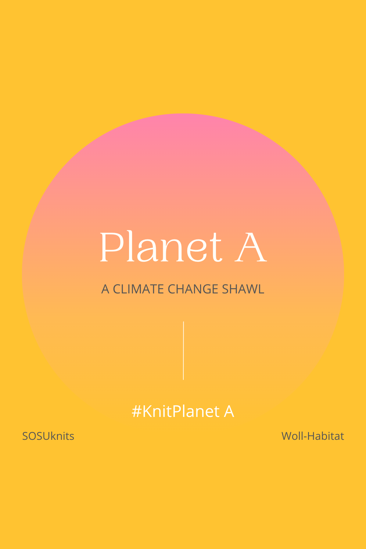
Visualize, comprehend & fight Climate Change – Because there is no Planet B!
It’s getting hot in here – but not just that, the weather is getting more and more extreme with climate change progressing. But how much has the climate changed, really?
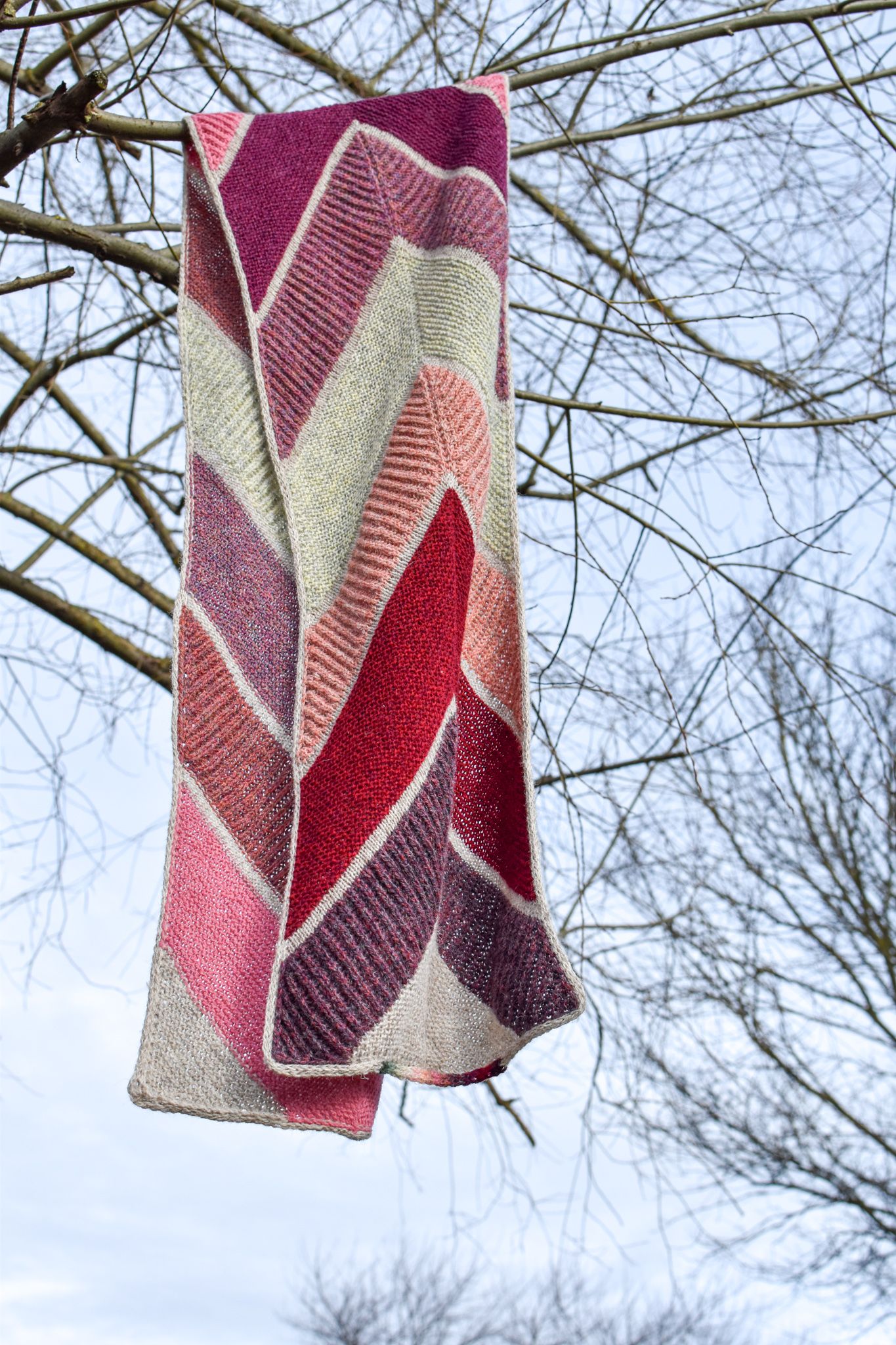
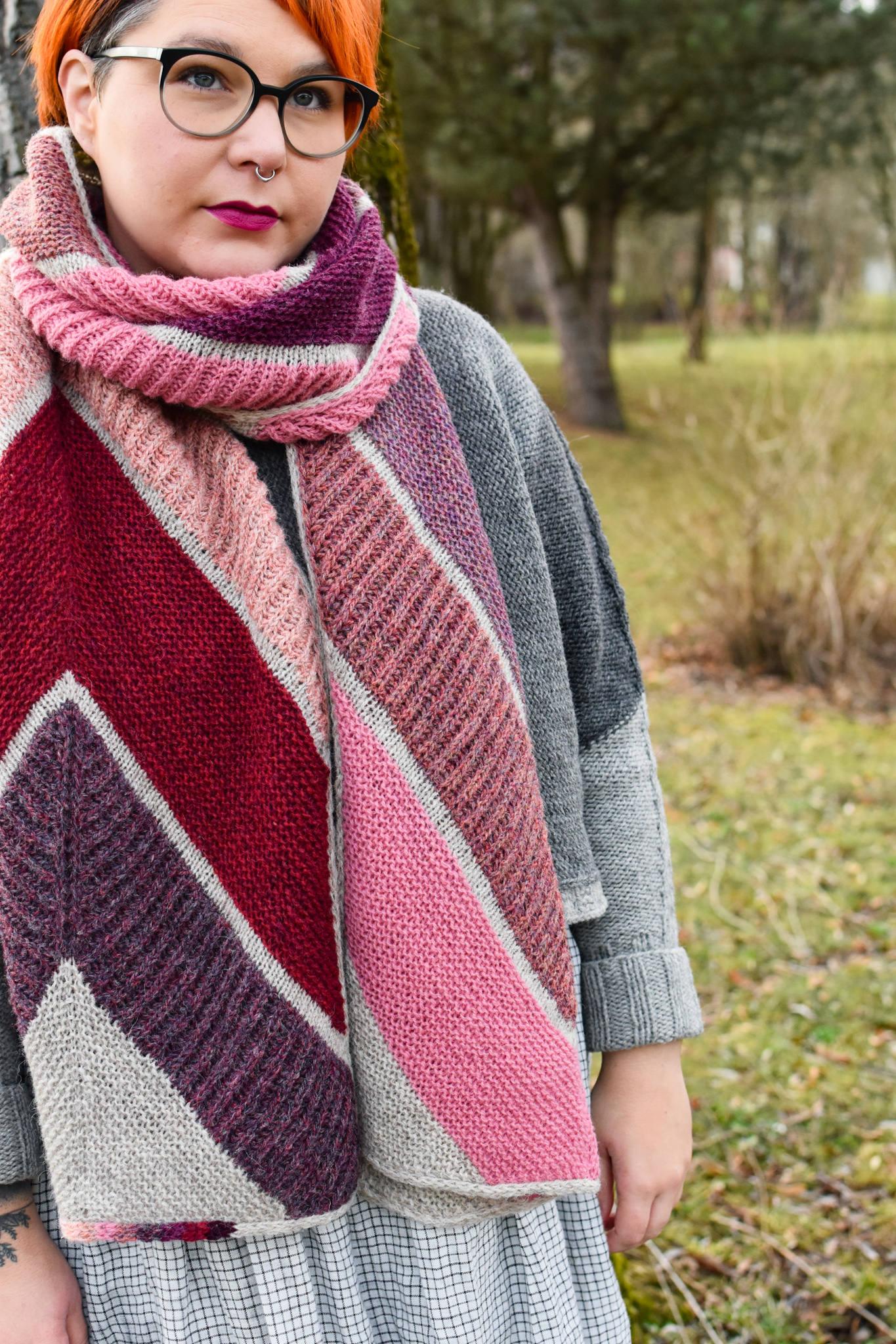
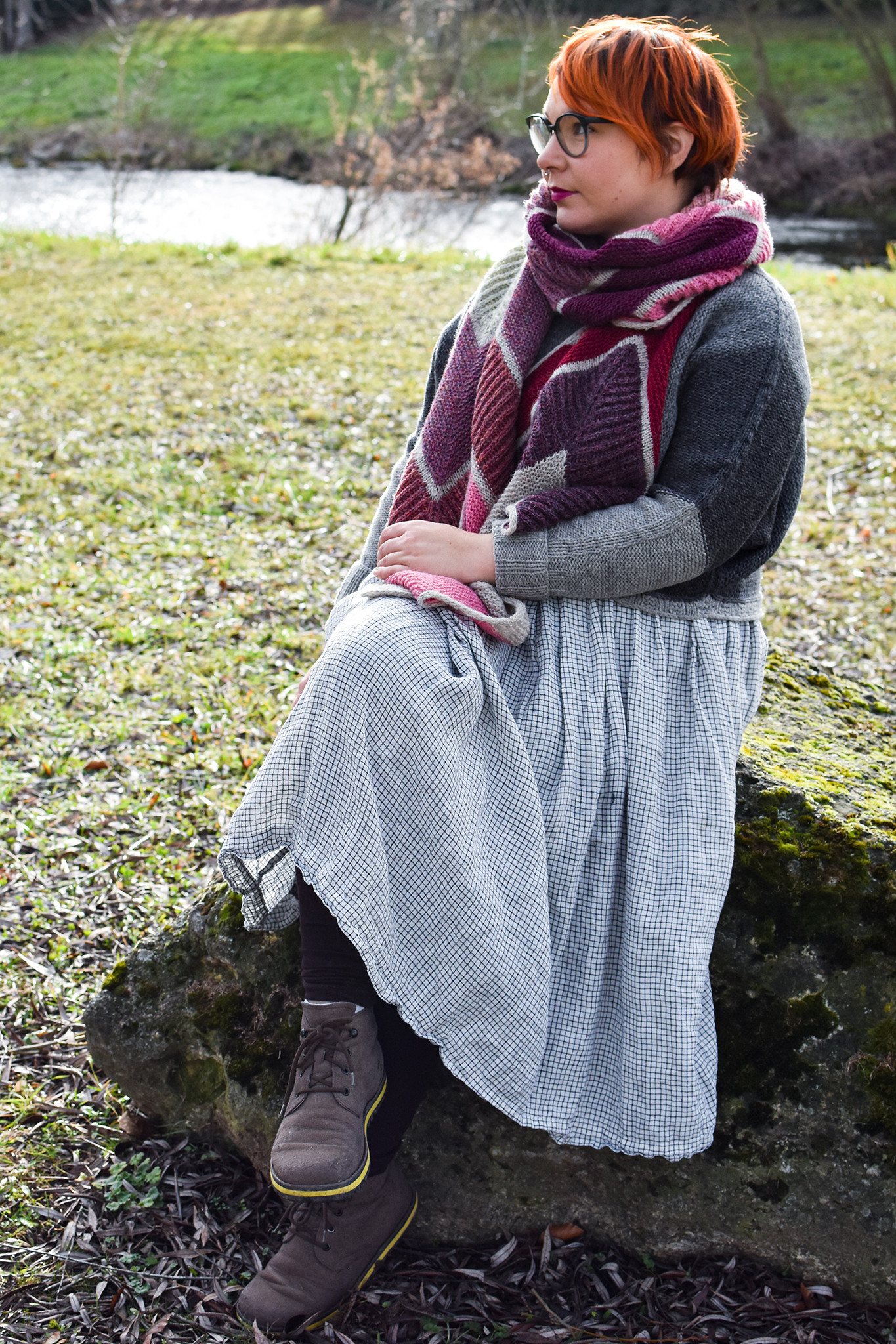
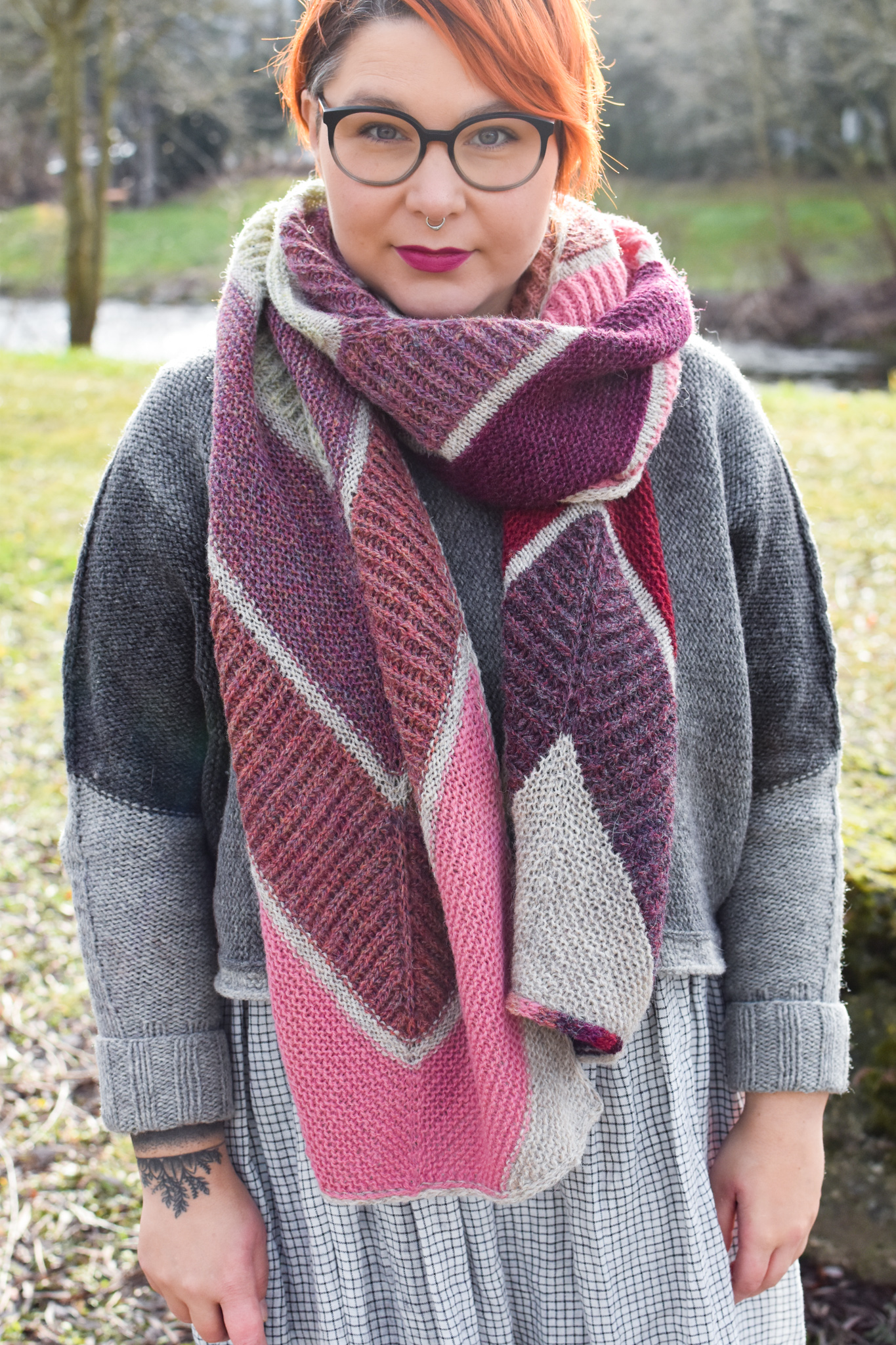
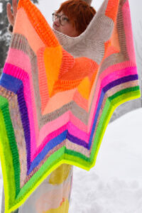
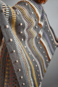
“Planet A” visualizes how much each month’s temperature differs from the long-time average, showing just how extreme our new normal is.
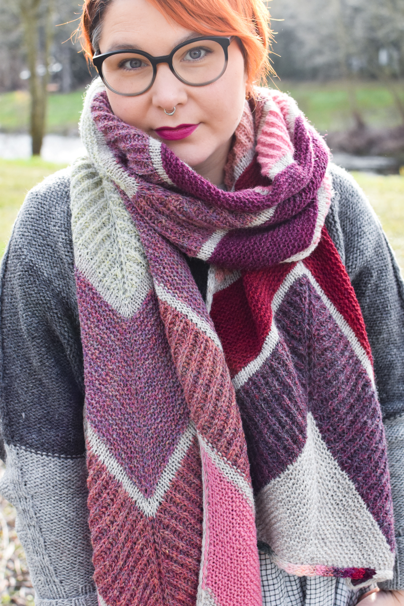
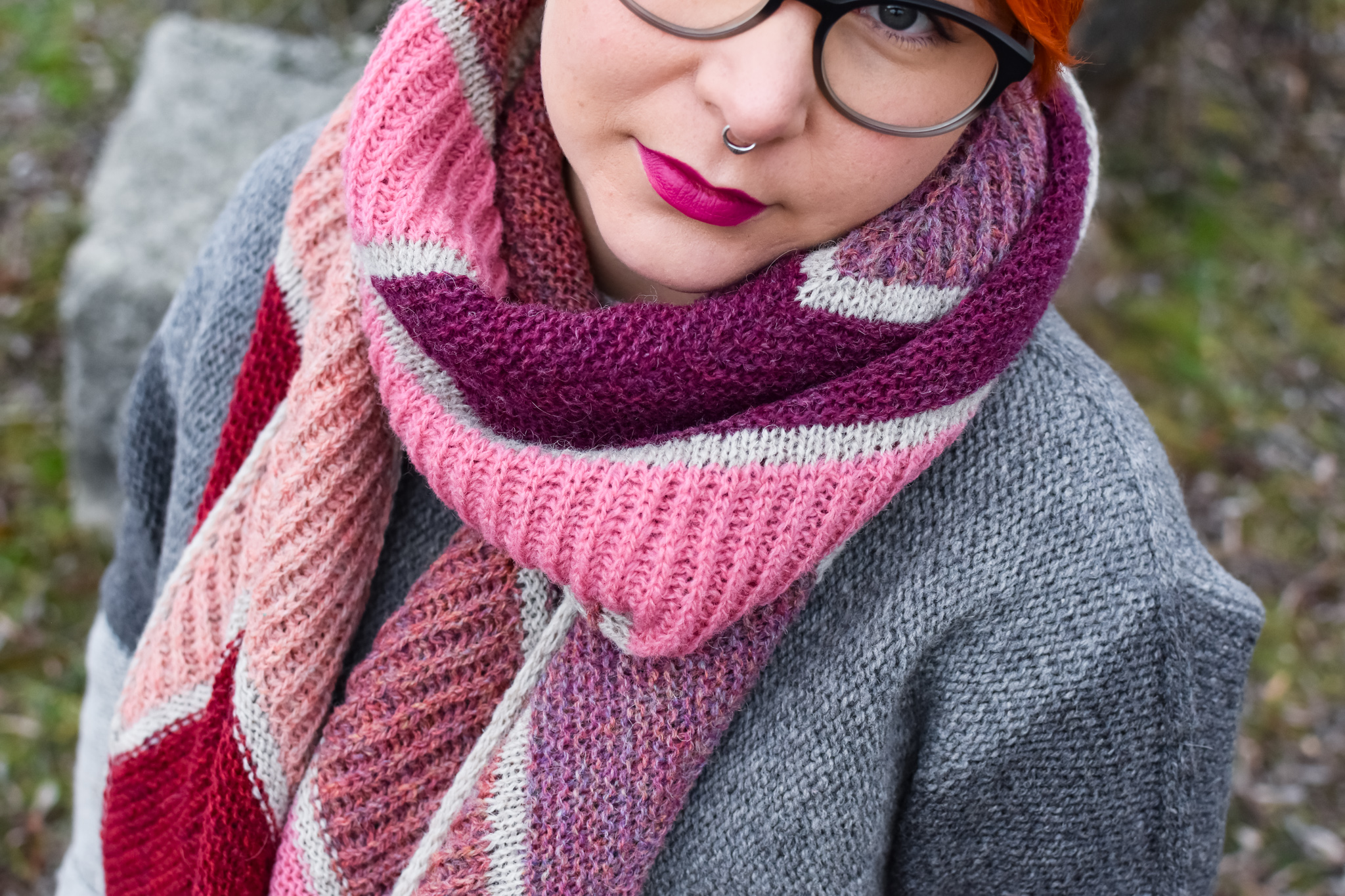
By turning complex data into a wearable accessory, it can more easily become a talking point and conversation starter and hopefully not only lead to more awareness but individual action and mitigation of the climate crisis.
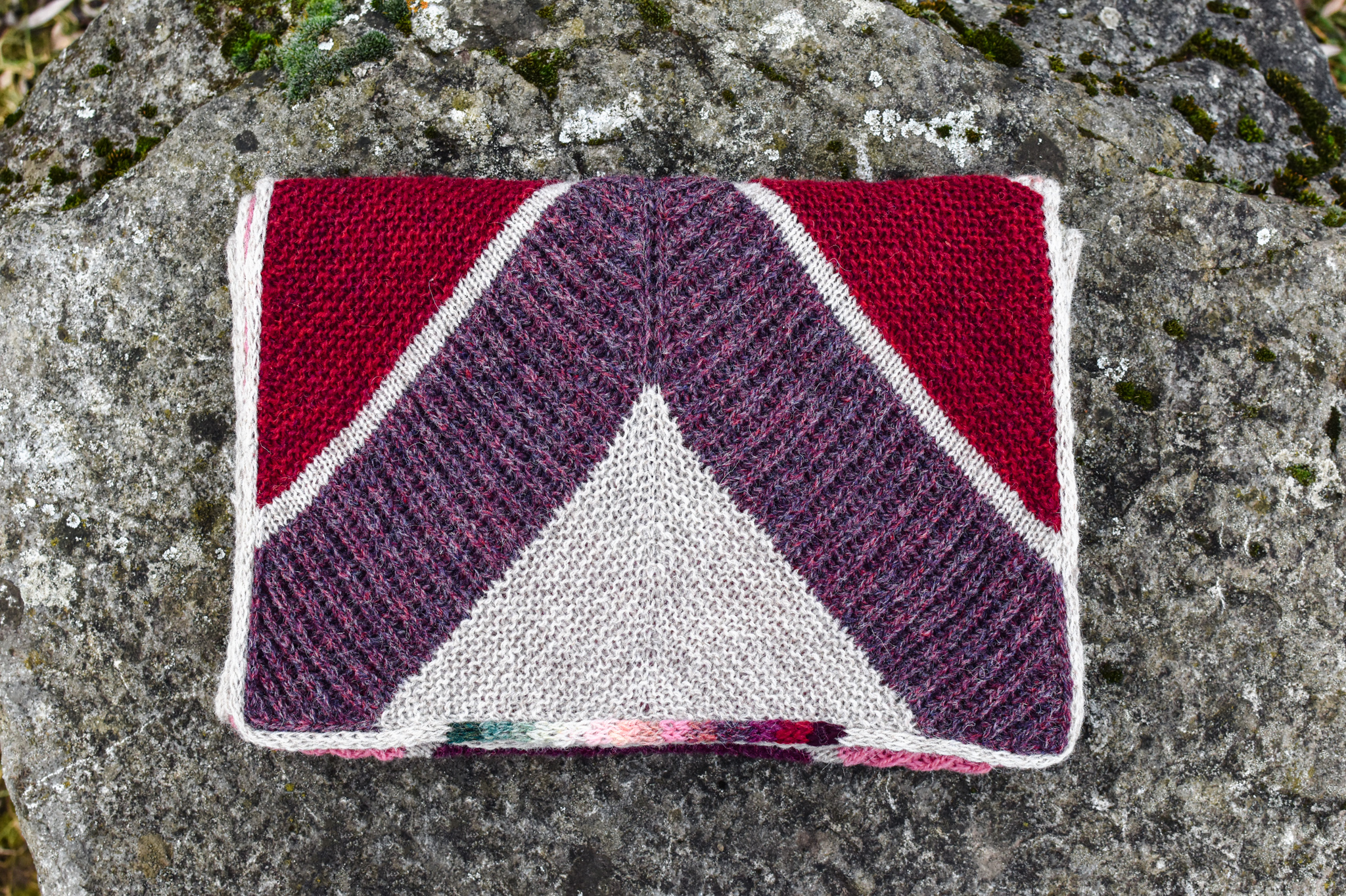
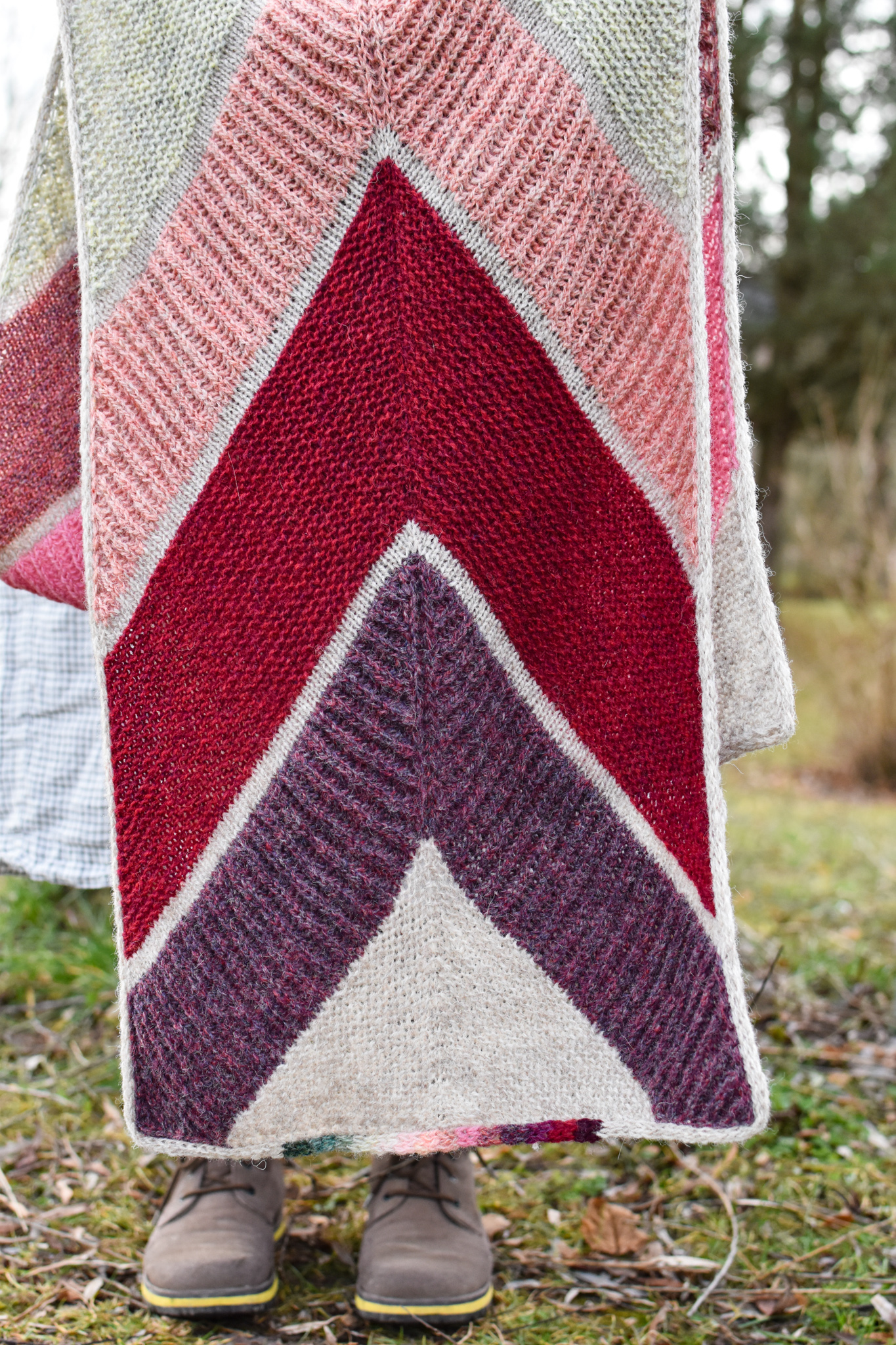
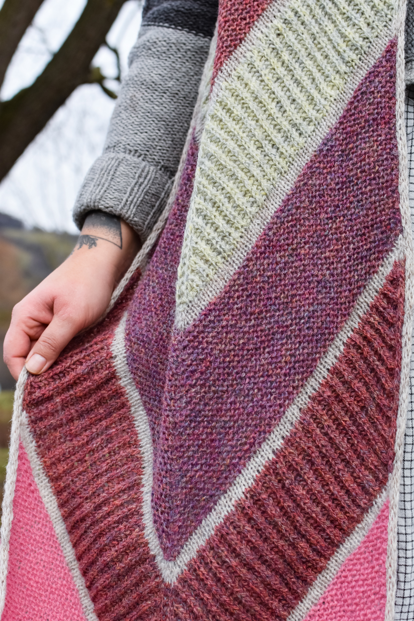
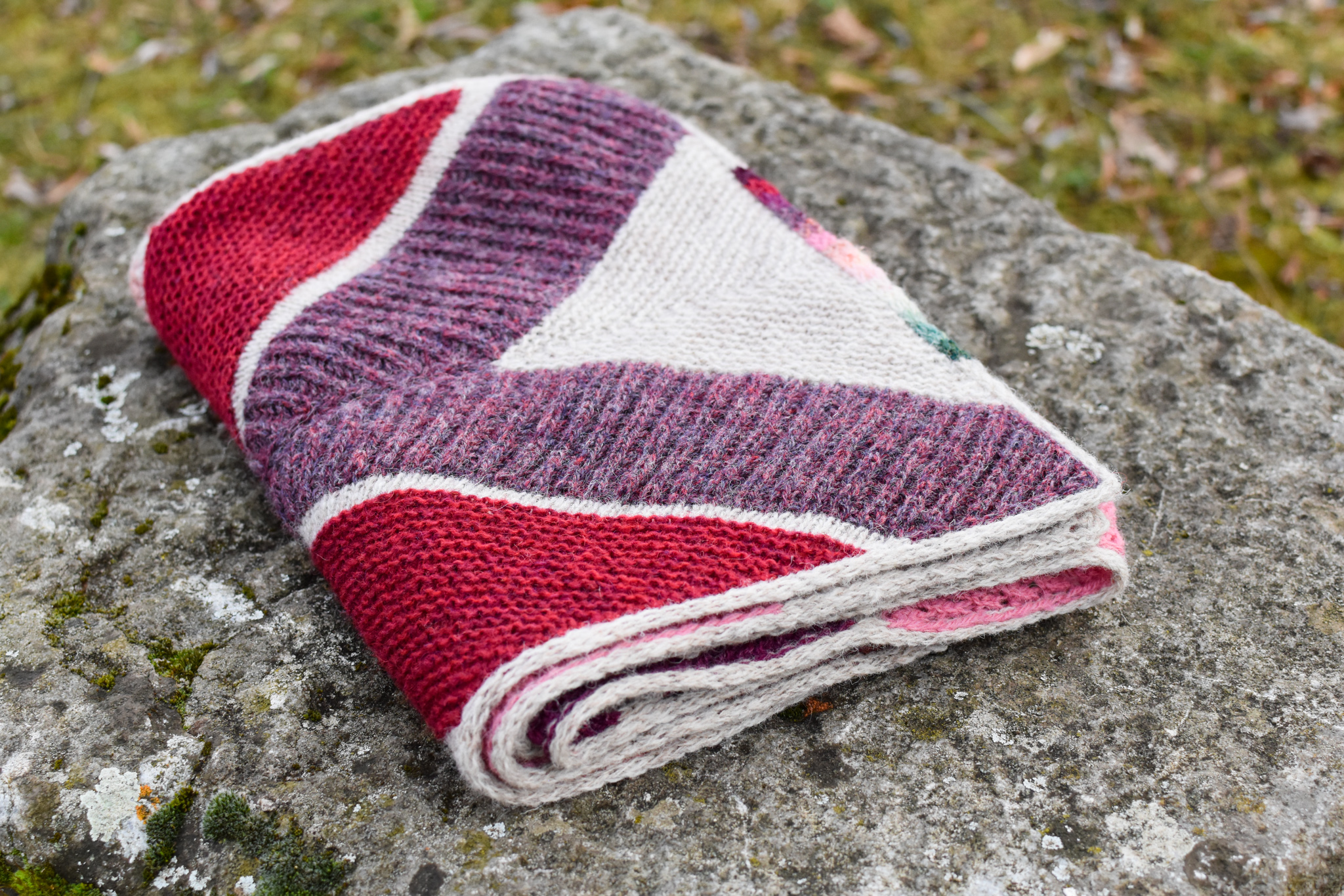
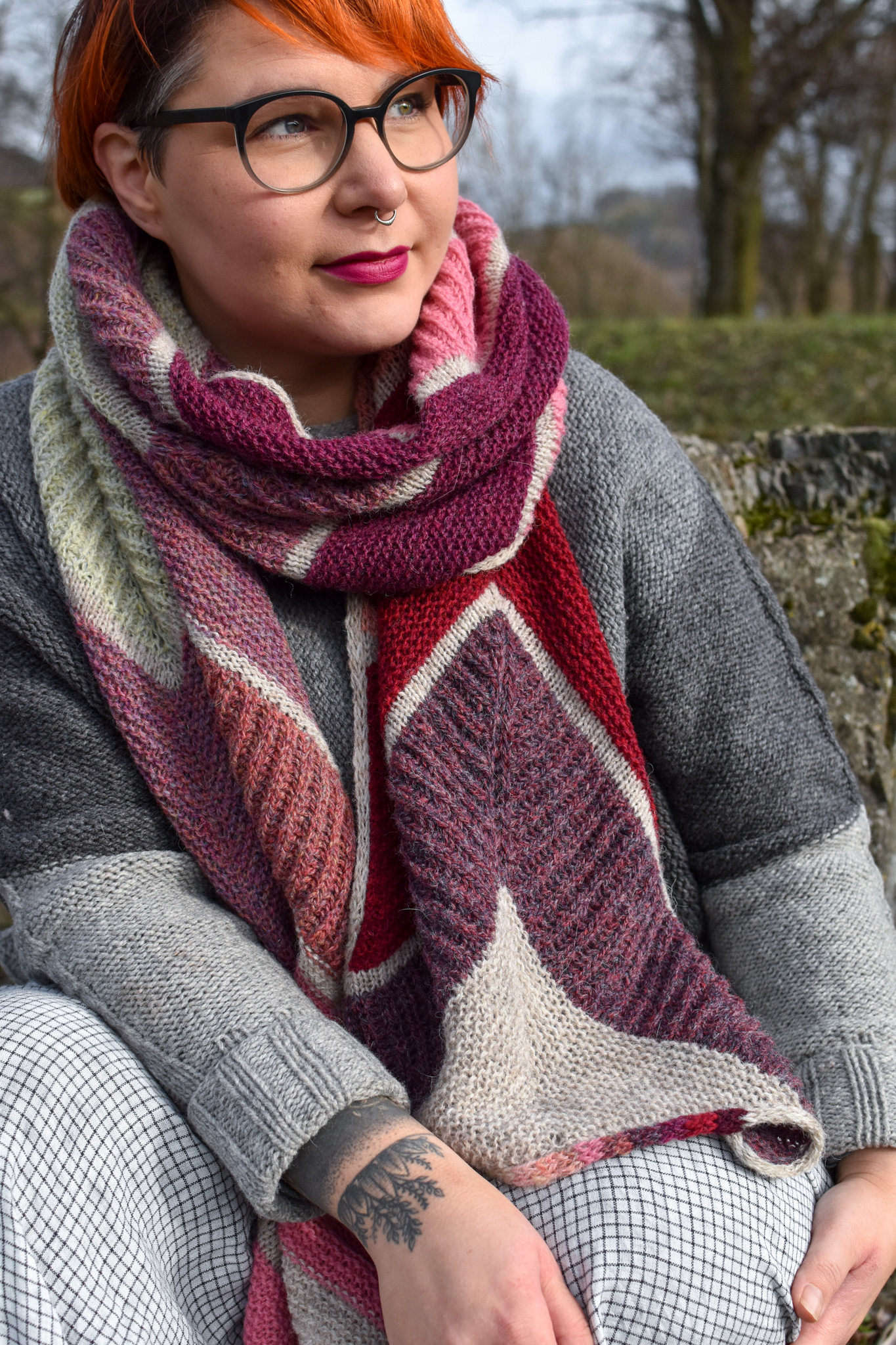
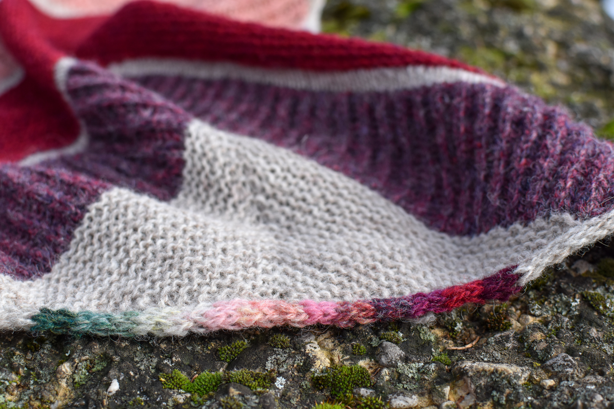
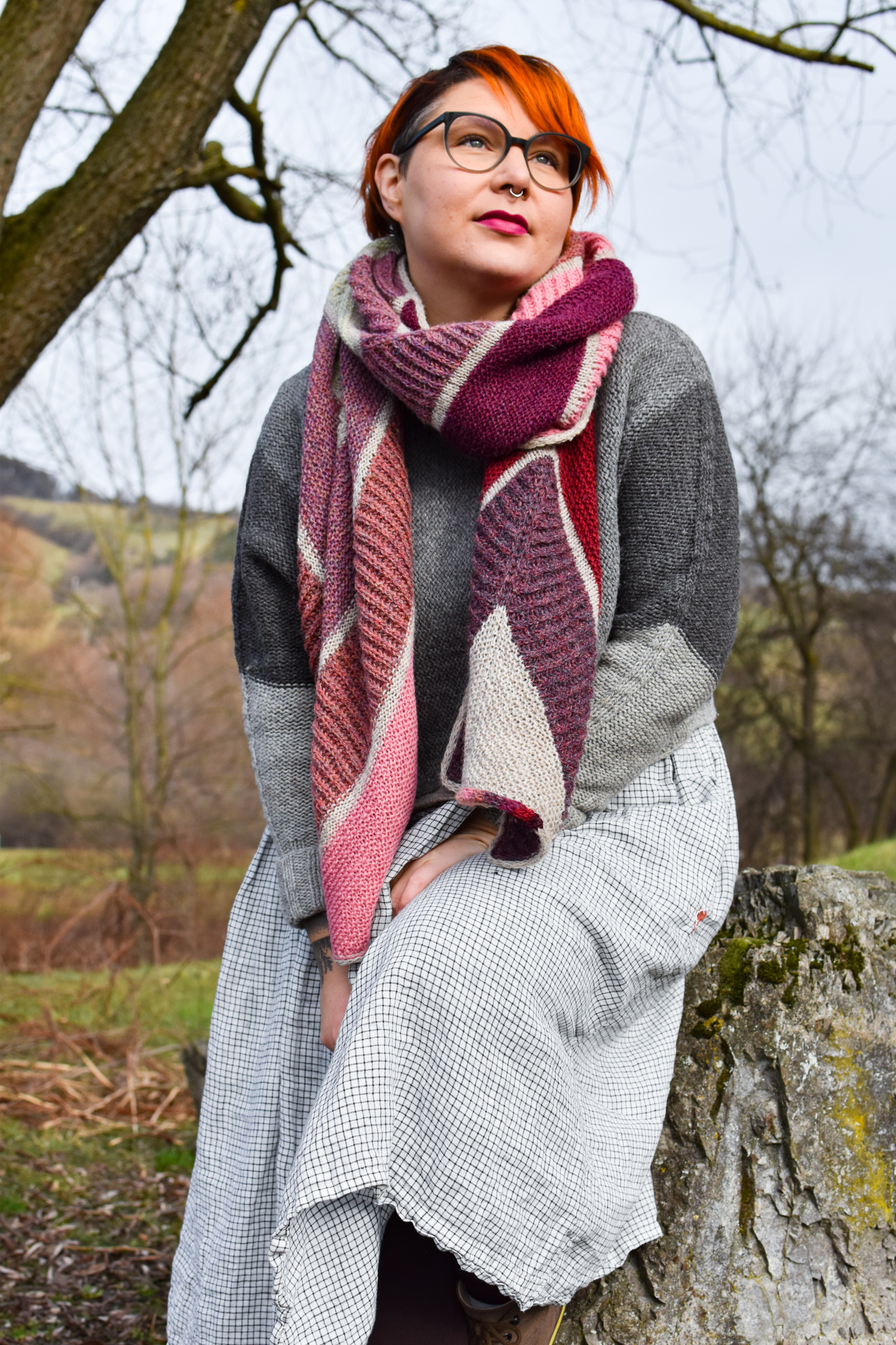
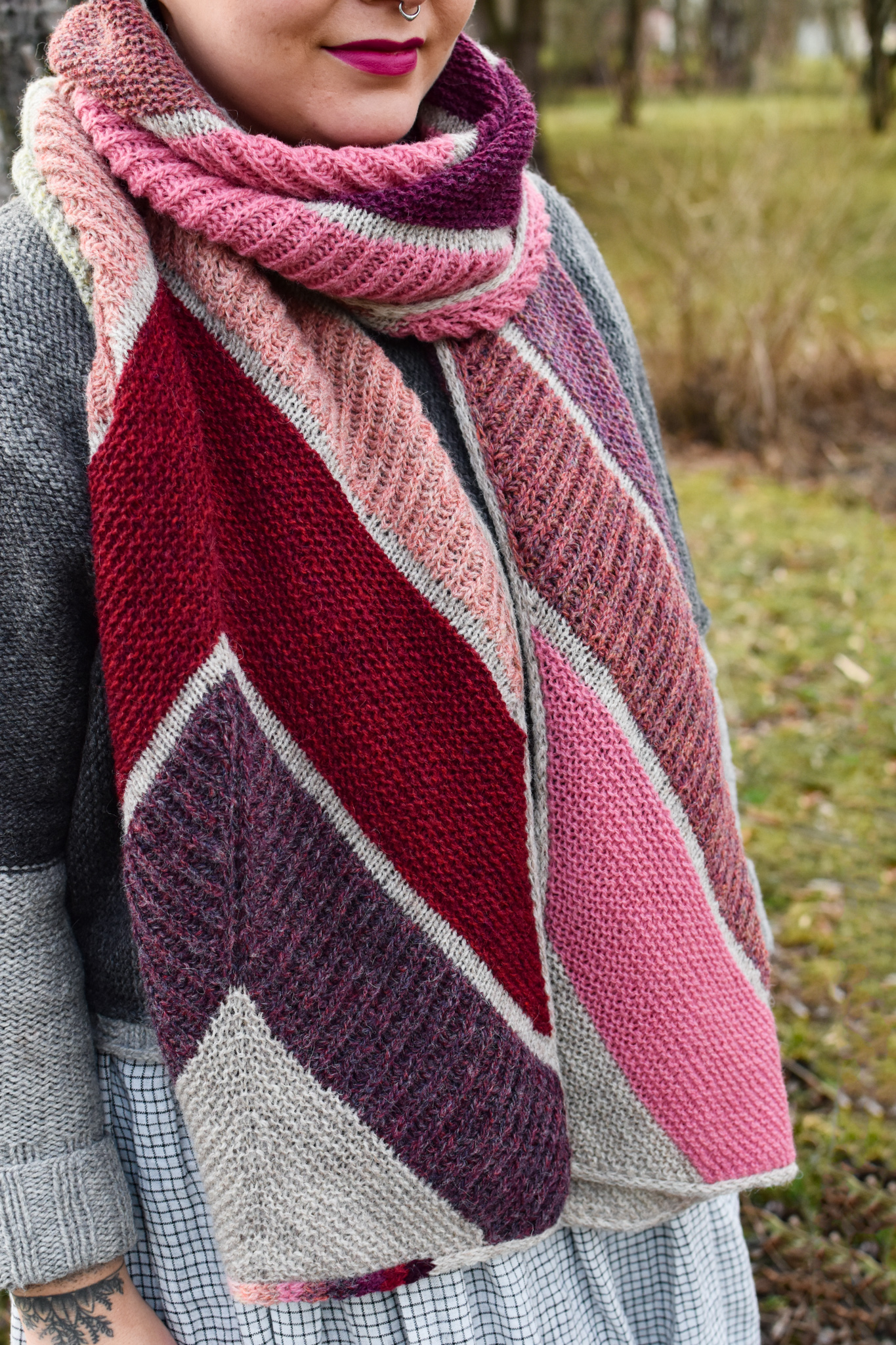
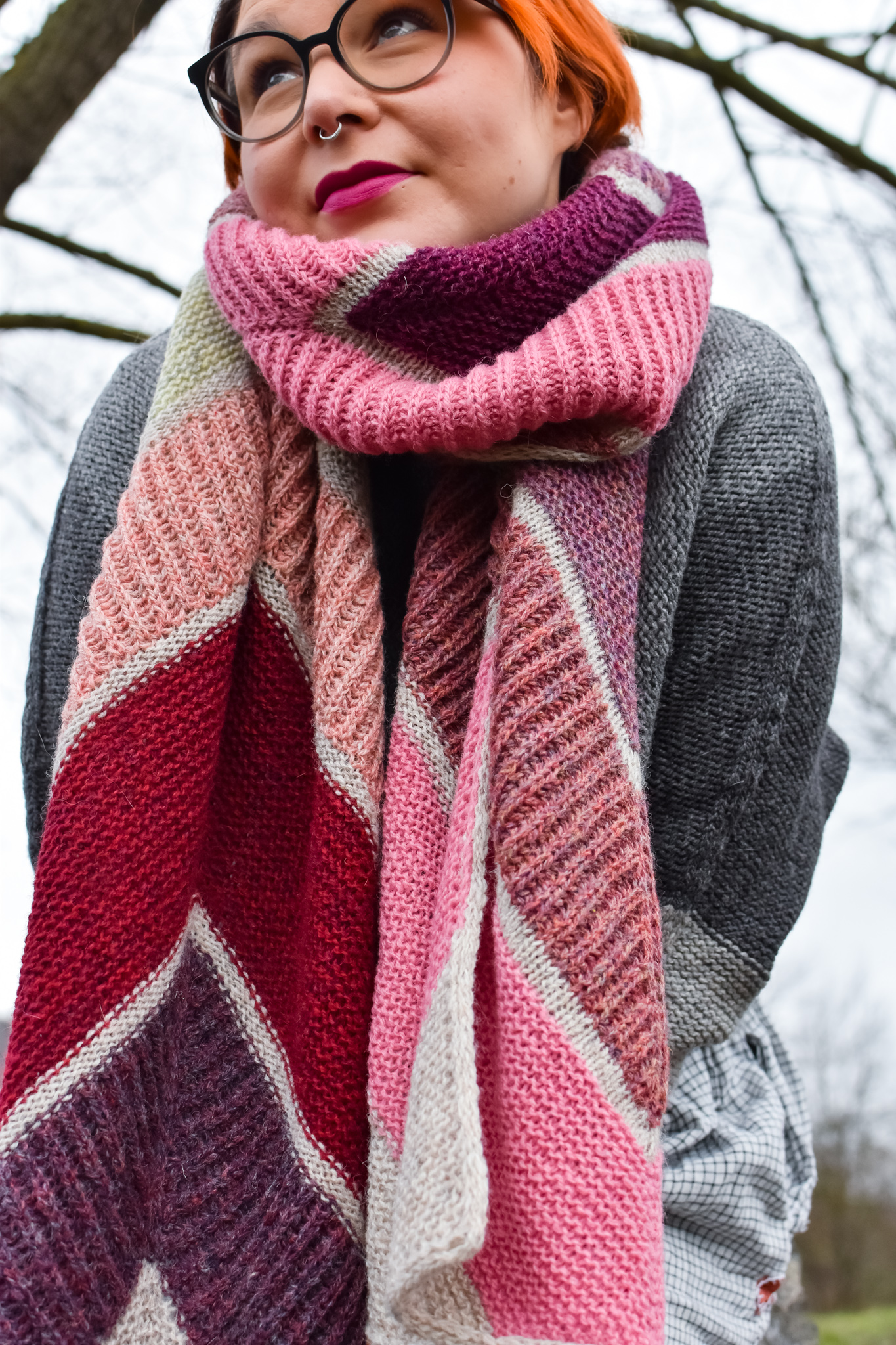
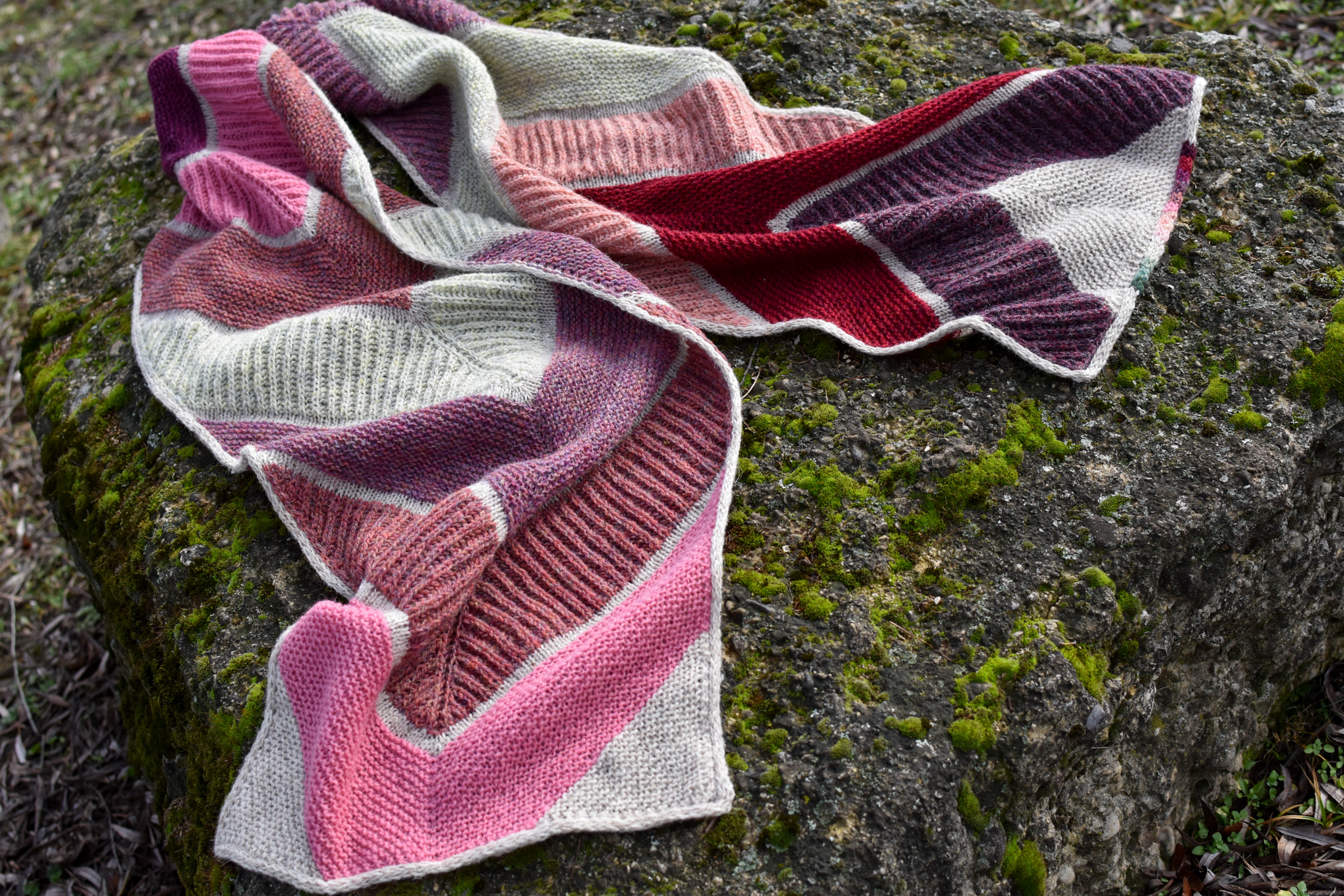
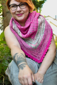
As opposed to temperature blankets or shawls, the “Planet A” project does not represent the daily weather but the difference from the monthly average temperature to the long-term monthly temperature (over a 30-year period) of a region. This visual representation of climate change hopes to make this complex topic more comprehensive and accessible.
Information on how to access climate data and how to translate it into a color scheme can be found in the separate info document.
Join Planet A Knit-A-Long on Instagram with the tag #KnitPlanetA.
Not a knitter? A crochet version is also available (thanks to Horst Zechmeister)! #CrochetPlanetA
Where in the world is your Planet A? Mark your location on this Google Map!

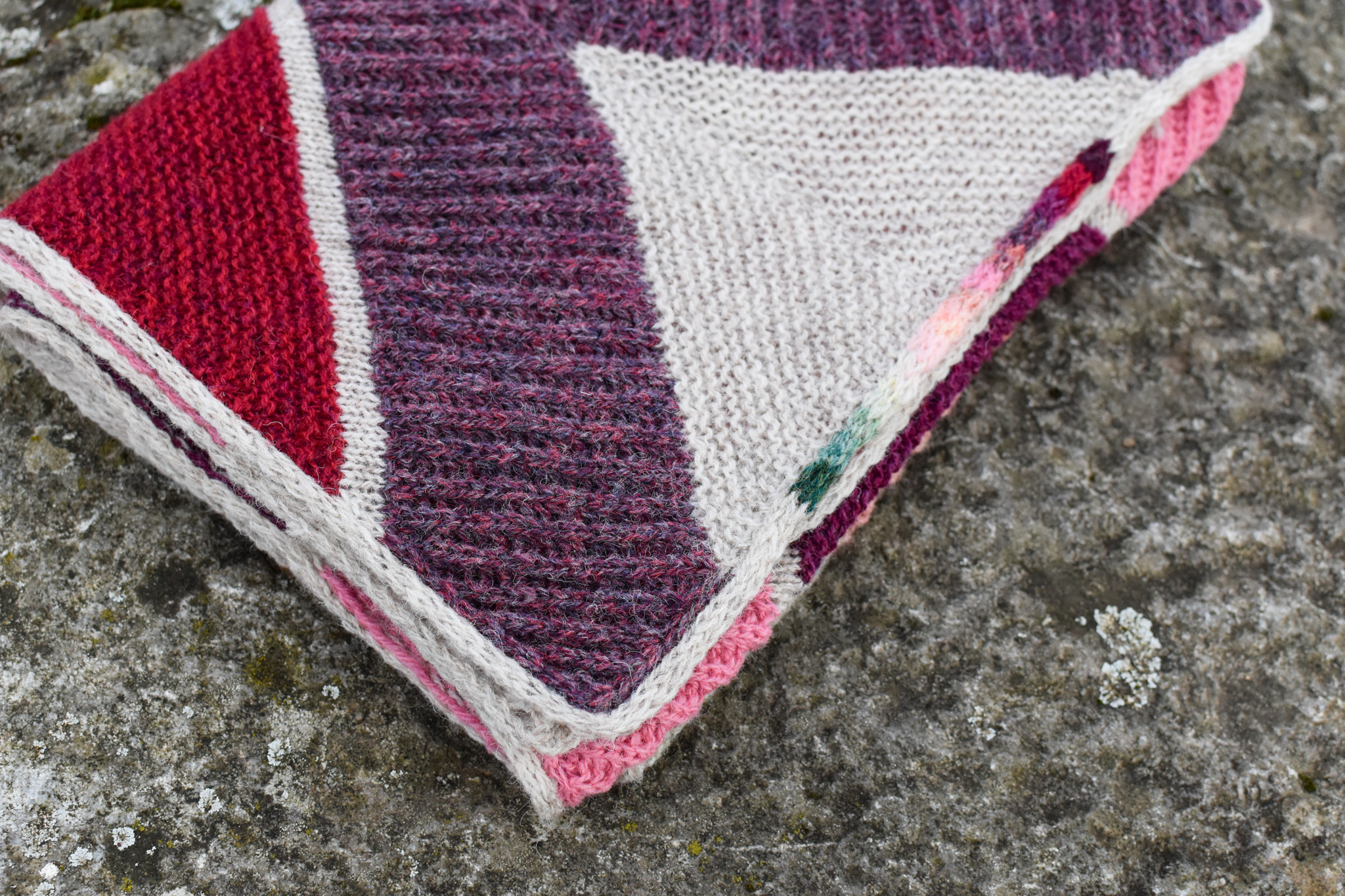
The pattern can be knit in Garter stitch or Brioche, or a combination of the two stitch patterns (as pictured).
Scarf:
Length: 200 cm / 78 ½″
Width: 40 cm / 15 ½″
Shawl:
Length: 185 cm / 73″
Width: 60 cm / 23 ½″
21 sts / 34 rows = 10 cm / 4″ in Garter stitch
21 sts / 17 rows = 10 cm / 4″ in Brioche stitch (2 worked rows = 1 counted row)
(after blocking)
US 6 / 4 mm needles, 60-100 cm / 24-40″ long;
(or size needed to obtain gauge and optimal drape)
plus larger needle size for bind-off
tapestry needle, 1 stitch marker
Fingering weight yarn
(about 360-420 m per 100 g):
Scarf: 1122 m / 1226 yd / 14 skeins* in total
Shawl: 1726 m / 1890 yd / 17 skeins* in total
* The number of skeins refers to the yarn used for the pictured sample.
Shetland Spindrift by Jamieson’s of Shetland
(100% Shetland wool, 105 m per 25 g skein)
following the pink-green color scheme (see info file); climate data of St. Pölten (Austria), 2022
Pictured in the scarf version.
To use a coupon code when shopping on on Ravelry, click on the Ravelry button above, place the pattern(s) in the shopping cart. You can enter the coupon code in the cart before continuing with the check-out. Only one promotion applies at a time.
Please make sure you’re logged in to you Ravelry account before checking out.
If you can’t find the pattern you purchased in your Ravelry library, you were most likely not logged in. Please used the Ravelry Purchase Finder to add your pattern.
Please check the box in the popup window before completing the purchase to receive pattern updates!
Sales and coupon codes are only available on Ravelry & Payhip.
LoveCrafts only allows one PDF file per pattern. You will receive one file that contains all language versions in the Standard layout. Additional layout versions are not available.
SOSUknits patterns are for individual use only and are protected by international copyright law. In purchasing/downloading this pattern you agree to use this pattern and all items made from it only for your personal non‐commercial use. You may not distribute or sell electronic or paper copies of this pattern.